It’s The Truth! OPPO Coloros Has Come A Long Way And Their Skin Is Now, Truly, The Best Android Skin Customisation I’ve Used In A Long While.
Saying this statement sounds weird even to me. But It’s The Truth! OPPO Has Come A Long Way And Their Skin Is Now, Truly, The Best Android Skin Customisation I’ve Used In A Long While. And that’s saying a lot, because if you remember my OPPO Find X review, you know I really made noise and complained about ColorOS being confused and everywhere. Things have changed.
First of all, as a reviewer, I get to use lots of phones. In the past year, I’ve interacted with lots of OPPO devices. So I’m not basing the thoughts in this article on a single phone. This is something I’ve thought about very much over the year while testing out many different devices. This is something that stood out to me whenever I switched between Transsion phones, Xiaomi devices, my Samsung devices, and OPPO devices.
ColorOS used to be cluttered with useless Apps, annoying bloatware, lack of an App drawer, and stupid icons that copied Apple’s iOS. The settings page was a whole mess on its own. I don’t know why OPPO back then thought that was a good idea. It may have been to build a name, or it may have been to impress people who wanted iOS but couldn’t afford iPhones. However, it made many of us, including me, personally shy away from OPPO devices.
I remember whenever I wanted to buy a new phone, OPPOs were out of question not only because of the stupid cameras’ beauty mode, but also because I found there’d be an annoying learning curve trying to find my way around the UI. But here we are straight from 2020 through to 2021 where OPPO devices stay longest in my pocket. I know I’ve already told you numerous times I love the OPPO A93. OPPO made a turnaround in their approach to ColorOS, and these changes are the reasons why the UI has become my favourite:
- New Launcher now with Google Cards on the left – Like Stock Android
- Cleaner, better overall user interface – Like Stock Android
- Embracing official Google apps – Like Stock Android
- Faster, reliable security and system updates
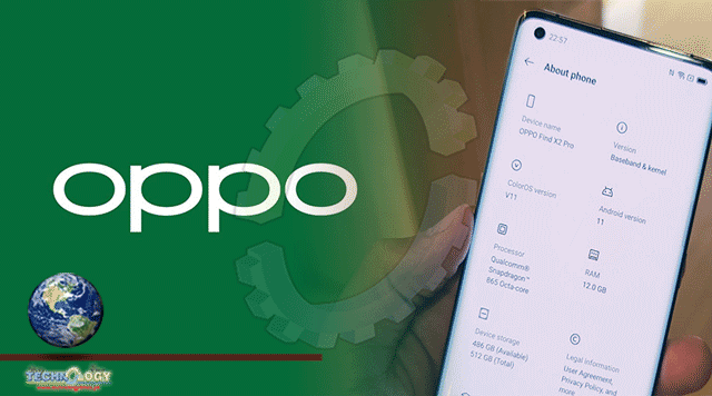
- The Settings page is well organised, and more intuitive
- Reduced bloatware – Not as much, or as annoying as the past. Most of these are easy to uninstall.
- No annoying Ads – way better experience compared to XOS from Infinix, and HiOS from TECNO, or MiUI from Xiaomi
Everyone knows stock Android has its shortcomings. It lacks lots of features that are very important in ensuring a good experience. But the look of it, its arrangement, and the official Google apps are really good. OPPO has embraced that latter bit really well, while dealing with the former shortcomings by including its extra things in the Settings App. So essentially, you’re getting a close to stock feel in terms of the launcher and the apps, with a well organised skin in the Settings.
The launcher is clean. Yes, you still have to opt to having an App drawer, but once that is done, you have a really clean looking launcher. The stock gesture of swiping to the left to reveal recommended Google Cards is here. Adding homepages, changing wallpapers, adding widgets and all that is really easy, and intuitive.
All through, the UI is cleaner, with more stock-like icons, with things being where they are supposed to be. Android gestures work well both for the Google Assistant and for other things like seeing all open apps, changing app window sizes (introduced with Android 11), and quickly going between different apps. It is all very smooth, easy and intuitive.
One thing I hated very much in the past, and something that’s still happening with Samsung’s ONE UI, some realme phones, Vivo phones, and even Xiaomi devices is the unnecessary doubling of apps. In these mentioned phones you’ll find a standalone dialler, messaging app, browser, third part App Store, and much more. Which means if you prefer Google’s Messages App, you have two apps on your phone. If you prefer Google Chrome, you have two apps. You are forced to have these apps on your device, including these third party App Stores, which you never get to use. OPPO decided to just embrace the stock Google Apps with ColorOS.
So on my device, the default dialler is from Google, so is the messaging app, so is the browser, and much more. This is something that has made me really love using ColorOS because there’s no downloading Google Apps and disabling or hiding other apps.
What kept me from using OPPO phones in the past is the same thing that’s keeping people from TECNO’s, and Infinix’s phones. Annoying bloatware, ads everywhere, and a noisy launcher is not something inviting. Hopefully in 2021, Transsion changes course and embraces a more stock UI. Tell me your thoughts. What’s your favourite Android Skin?
This news was originally published at Techish.